

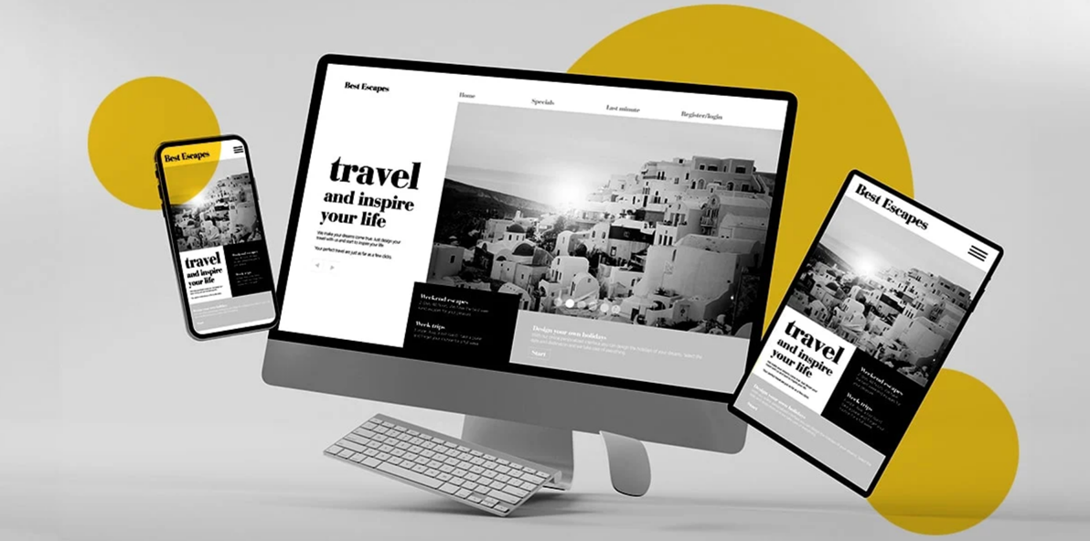
A beautiful website is not the same thing as an effective one.
That is one of the biggest misconceptions we’ve see when working with small business owners. Many people invest a lot of money into a website that looks polished, modern, and professionally designed, only to find that it does very little for the business itself. It might look impressive on screen, but if it is not bringing in enquiries, bookings, calls, or sales, then it is not really doing its job.
And that is where so many small businesses get stuck.
They assume poor results mean they need more traffic, better SEO, or a full redesign, when in reality the problem is often much simpler. The website is not built to convert. It has been treated like an online brochure instead of a practical business tool.
That is an important distinction.
A brochure-style website may tell people who you are and what you do, but a conversion-focused website guides people toward action. It helps visitors understand your offer, trust your business, and know exactly what to do next. Without that structure, even a very attractive site can underperform.
Over the years, we have worked with many Cape Town small business owners who came to me frustrated because their website “looked fine” but was not generating real results. In most cases, the issue was not that the business was doing something wrong. It was that the website had never been built with strategy, user behaviour, and conversions in mind.
Here are some of the biggest reasons small business websites fail to convert – and the things most people are never told before they invest.
Design Is Not the Same as Strategy
This is one of the biggest reasons websites underperform.
Many web designers are very good at making a site look clean, stylish, and visually appealing. But visual design alone is not enough to make a website work as a lead-generating tool. A site can have beautiful colours, nice fonts, strong imagery, and still fail to convert if there is no strategic structure behind it.
This is where small business owners often get caught out.
They assume that if a site looks modern, it must also be effective. But websites are not judged by visitors the same way they are judged in a design portfolio. Potential customers are not admiring spacing, layout trends, or clever animations. They are trying to answer a few basic questions as quickly as possible:
- Am I in the right place?
- Does this business offer what I need?
- Can I trust them?
- What should I do next?
If your website does not answer those questions clearly, the design will not save it.
A strategic website is built around user behaviour. It considers what information people need first, what might cause hesitation, what builds confidence, and how to guide them naturally toward contact or purchase. Without that thinking, the website becomes decorative rather than functional.
That is why so many small business websites end up looking impressive but acting like digital flyers.
A website should not just display information. It should direct attention, remove confusion, and support action.
There Is No Clear Path to Contact
One of the most common conversion problems is simple: people do not know what to do next.
It sounds obvious, but it happens all the time.
A visitor lands on a homepage, scrolls through some general information, and then reaches the end with no strong direction. The contact details are buried in the footer. The buttons say vague things like “Learn More” or “Read More.” There may be too many menu options, too many competing messages, or no clear next step at all.
When that happens, people leave.
Online users make decisions quickly. If your website does not guide them clearly, they are not likely to work hard to figure it out. They will simply move on.
This is why calls to action are so important.
Every key page on your website should make it easy for visitors to understand what action to take next. That might be booking a consultation, requesting a quote, calling your business, filling out a form, or sending an enquiry. The action itself may vary, but the direction needs to be obvious.
A strong website usually includes:
- clear buttons with direct wording
- visible phone or email contact details
- enquiry options placed throughout the page
- homepage messaging that leads naturally into action
- simple navigation without too many distractions
This does not mean every page needs to feel pushy or overly sales-focused. It simply means your website should not leave visitors guessing.
Clarity converts. Confusion does not.
Trust Signals are Missing
Even if someone likes your website and understands what you offer, there is still one big question in the back of their mind:
Can I trust this business?
This is where trust signals make a huge difference.
Trust signals are the pieces of evidence that help visitors feel more confident about taking the next step. They reduce uncertainty. They show that your business is real, credible, and experienced. And for many small businesses, they are one of the most overlooked parts of the website.
A site with no testimonials, no reviews, no examples of work, no case studies, and no visible proof of credibility can feel like a risk – even if the business is excellent.
That is because trust online has to be earned quickly.
People cannot read your mind, and they cannot automatically know how good you are at what you do. Your website has to help communicate that.
Useful trust signals can include:
- client testimonials
- Google reviews
- before-and-after examples
- case studies
- portfolio images
- awards or certifications
- industry memberships
- years of experience
- recognisable client names or logos
These details help visitors feel reassured that others have worked with you and had a positive experience. For service-based businesses, especially, trust is often the deciding factor between someone contacting you or clicking away.
A website without trust signals can accidentally create doubt, even when the service behind it is excellent.
The Messaging is too Vague
Another reason websites fail to convert is weak or generic messaging.
Many small business websites use broad phrases that sound professional but do not actually say very much. Statements like “quality service,” “customer-focused solutions,” or “we go above and beyond” are common, but they are too generic to create real impact.
Visitors do not just want polished wording. They want clarity.
They want to know what you do, who you help, and why they should choose you over someone else. If your homepage is full of vague claims and fluffy language, it becomes harder for people to understand your offer quickly.
Strong website copy should be specific, natural, and easy to understand. It should sound like a real business talking to real people. It should explain the value clearly without hiding behind jargon.
Good messaging answers questions such as:
- What service do you provide?
- Who is it for?
- What problem do you solve?
- Why should someone trust you?
- What should they do next?
If your website tries too hard to sound impressive, it can end up sounding forgettable instead.
Simple and clear almost always convert better than clever and vague.
The Website Focuses on the Business, Not the Customer
This is another issue that quietly affects conversions.
A lot of small business websites talk too much about themselves and not enough about the person visiting the site. They lead with long company histories, broad mission statements, and internal descriptions that may matter to the business owner but do not immediately matter to the customer.
Visitors are usually thinking about their own needs first.
They want to know whether you can solve their problem, make their life easier, save them time, or deliver the result they are looking for. If your website does not connect your services to those needs, people are less likely to engage.
That means your content should shift from “here is everything about us” to “here is how we help you.”
Of course, your story and experience still matter. But they should support the customer journey, not dominate it.
The most effective websites make visitors feel understood. They reflect the customer’s problem, present a solution clearly, build trust, and then invite action.
That is how conversion-focused content works.
Too Many Distractions Get in the Way
Sometimes websites do not convert because they simply ask too much of the visitor at once.
There may be too many menu items, too many service links, too many pop-ups, too many colours, too many blocks of text, or too many competing calls to action. Instead of guiding the user, the website overwhelms them.
When that happens, decision fatigue kicks in.
People are less likely to take action when they feel overloaded. A cluttered site can create friction, even when the business itself is excellent.
This is why simplicity matters so much.
A high-converting website does not need to be empty or minimalist to the point of being bland. It just needs to be intentional. Each page should have a purpose. Each section should support that purpose. And the overall journey should feel easy, not chaotic.
Sometimes improving conversions is not about adding more. It is about removing what is getting in the way.
Mobile Experience Is Treated Like an Afterthought
Many small business websites are still judged mainly on how they look on desktop, even though a large percentage of visitors now browse on phones.
If your site is hard to read on mobile, slow to load, badly spaced, or difficult to navigate, it will almost always lose potential leads. People will not zoom in, hunt around, or struggle through a poor mobile experience for long.
A conversion-friendly mobile website should have:
- readable text
- simple navigation
- clear buttons
- fast-loading pages
- visible contact options
- forms that are easy to complete on a phone
If mobile usability is poor, everything else becomes harder. Even a strong message or good offer can be undermined by frustration.
That is why mobile performance should never be treated as an optional extra.
Final Thoughts
A website should be more than a digital placeholder.
It should be one of the hardest-working tools in your business – helping people understand what you offer, trust your brand, and take action with confidence. If it is not doing that, then the problem may not be traffic or luck. It may simply be that the site was never built to convert in the first place.
That is what no one tells many small business owners before they invest.
They are often sold appearance without strategy, design without structure, and content without conversion thinking. Then they are left wondering why the site looks good but does not deliver real business results.
The good news is that these problems are fixable.
Clearer messaging, stronger calls to action, better trust signals, smarter page structure, and a simpler user journey can make a huge difference. In many cases, improving conversions does not require a full rebuild. It requires a more strategic approach.
If your website is not bringing in the leads, enquiries, or results you expected, it may be time to stop asking whether it looks good – and start asking whether it actually works.
Big Web Media helps small business owners create websites that are clearer, more strategic, and built to convert – not just sit there looking pretty. If you are ready to make your website work harder for your business, get in touch.
